The opportunity
It was supposed to be an article
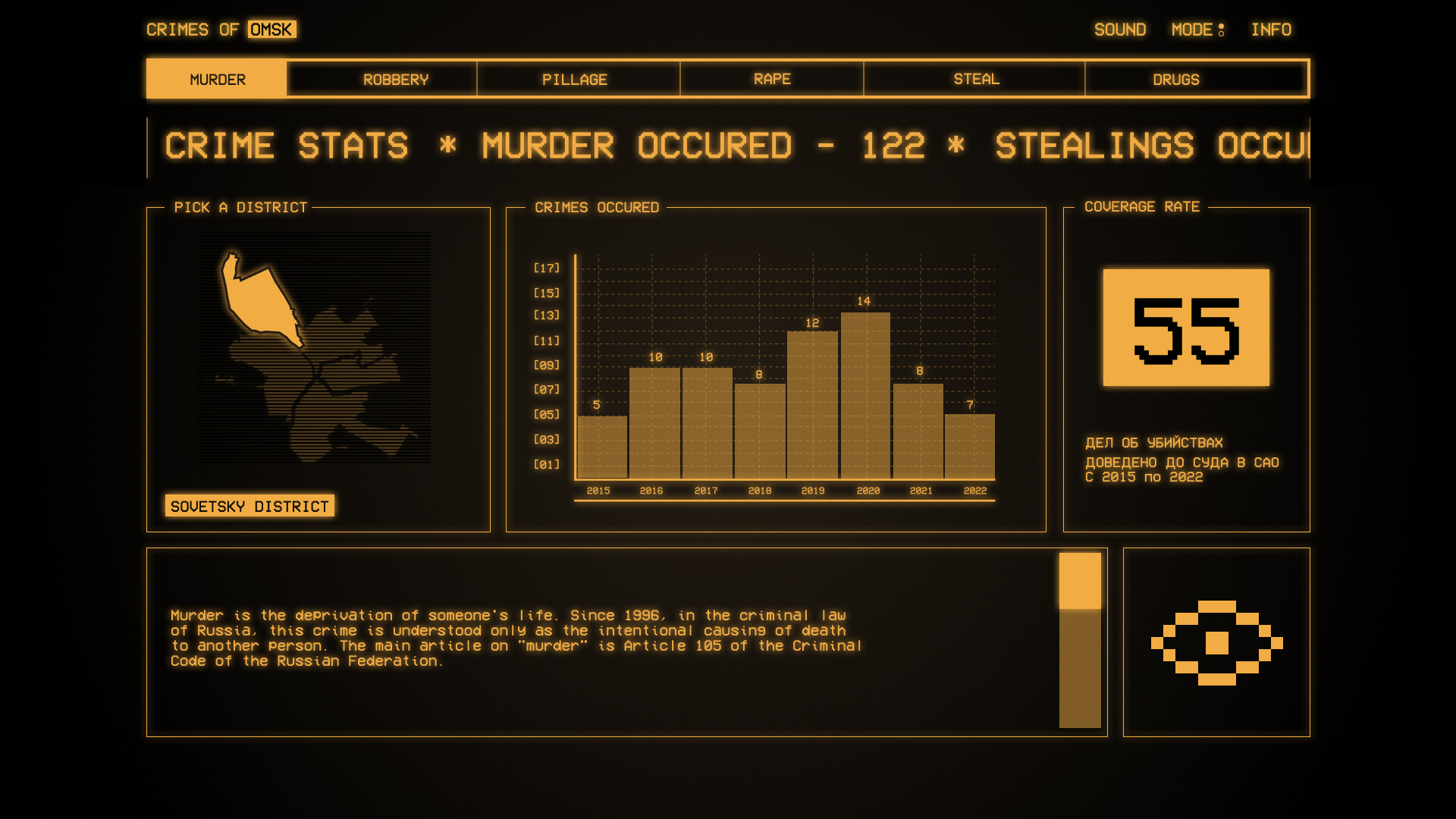
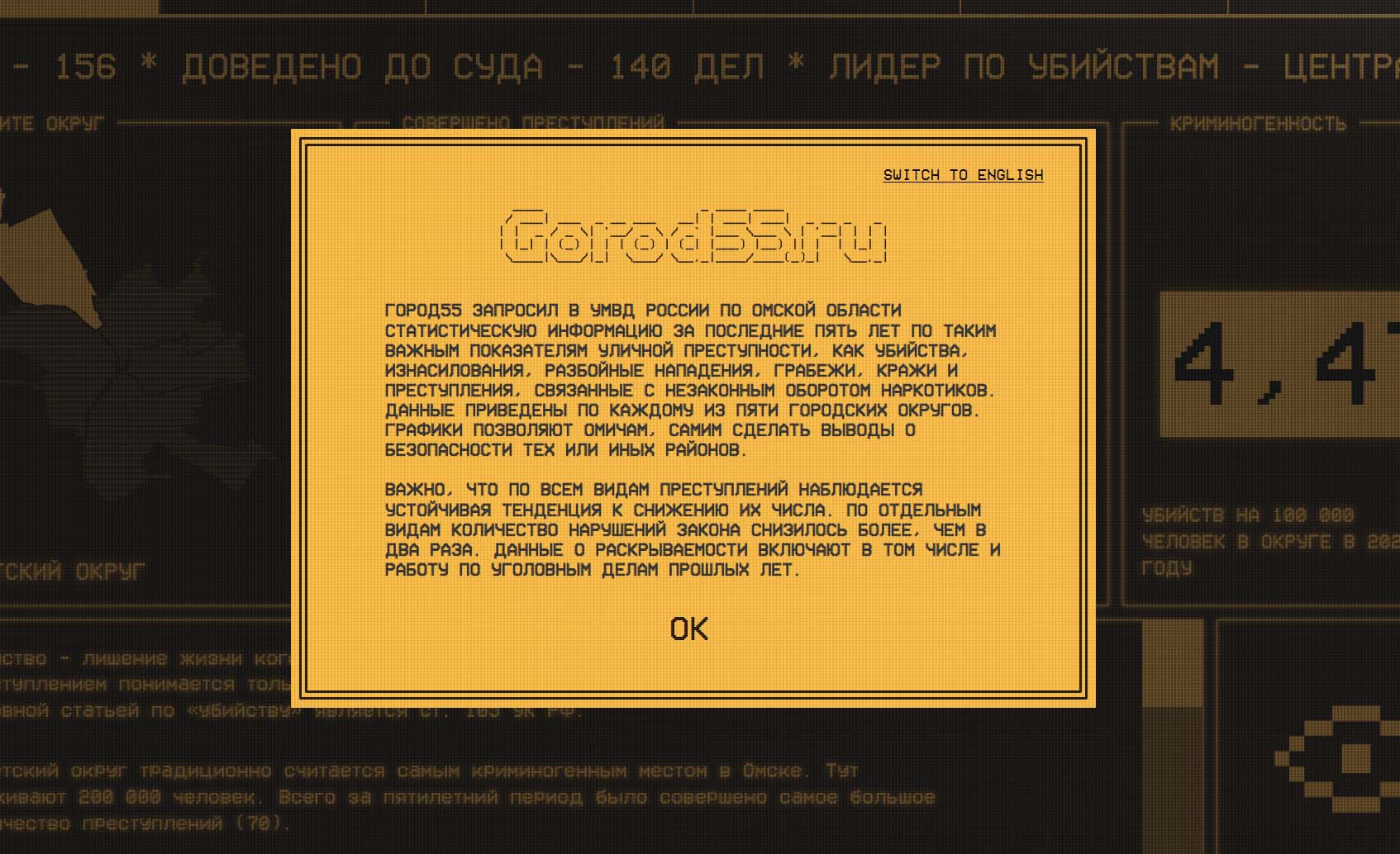
The original plan was straightforward: journalists would write the story, analysts would provide the crime statistics, and the result would be published as a traditional editorial article. I saw an opportunity to do something more ambitious. Instead of placing charts between paragraphs, I proposed turning the material into an interactive experience where data, storytelling, animation, and user interaction would work together. There was also a business reason behind the experiment: to demonstrate the company's creative and technical capabilities to potential advertisers looking for formats beyond standard display advertising.
From tables to stories
Making statistics worth exploring
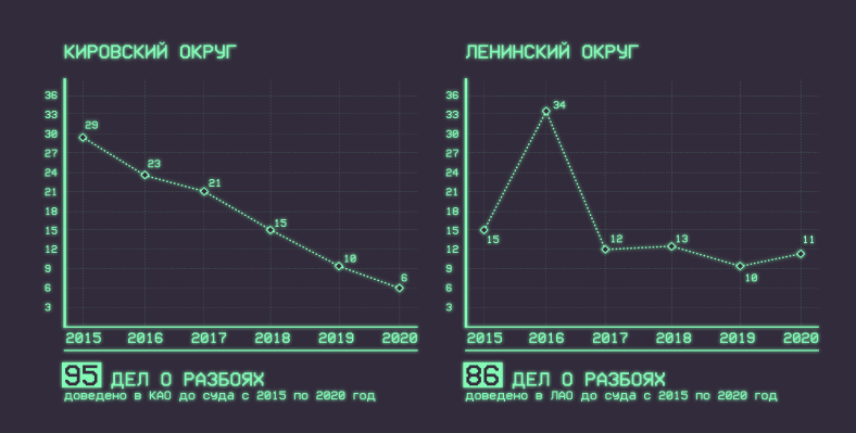
The raw material arrived from analysts as spreadsheets — useful for research, but hardly an engaging experience for readers. My challenge was to find ways to translate those numbers into visual stories that could be understood quickly while still encouraging exploration. Charts became part of the narrative rather than supporting illustrations: their appearance, animation, hierarchy, and interaction were designed around the story being told.
The goal wasn't to decorate the data. It was to make the data tell the story.
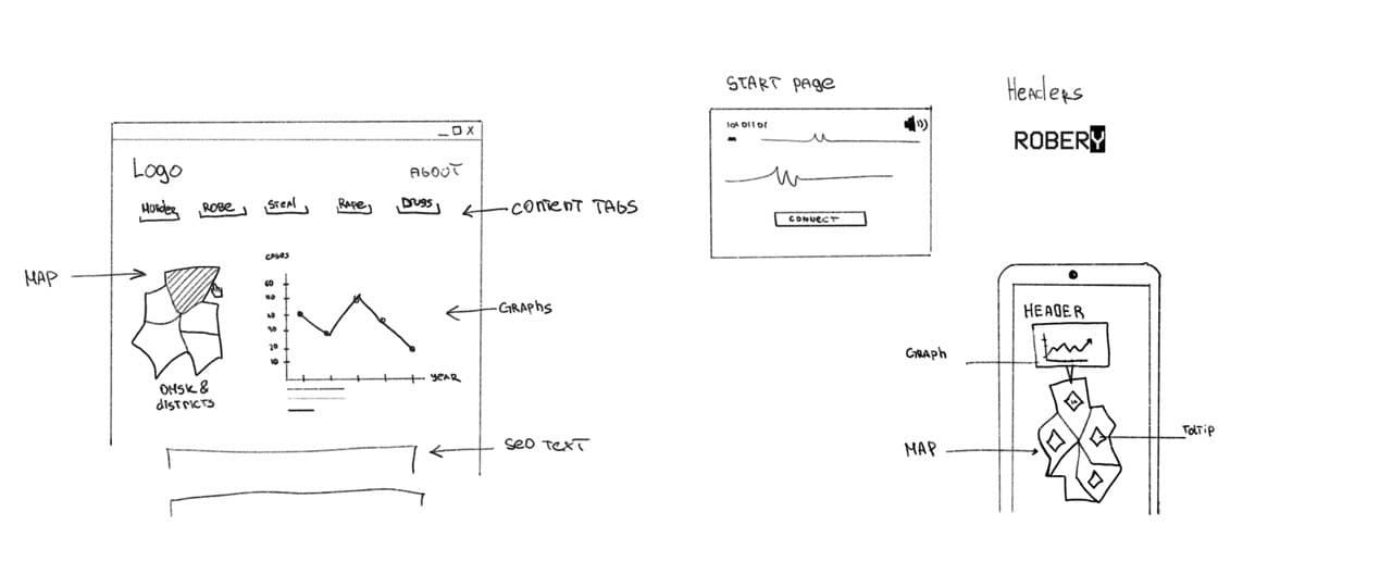
Raw spreadsheet → Sketch / concept → Static chart → Animated final version
Visual language
A city seen through its crime statistics
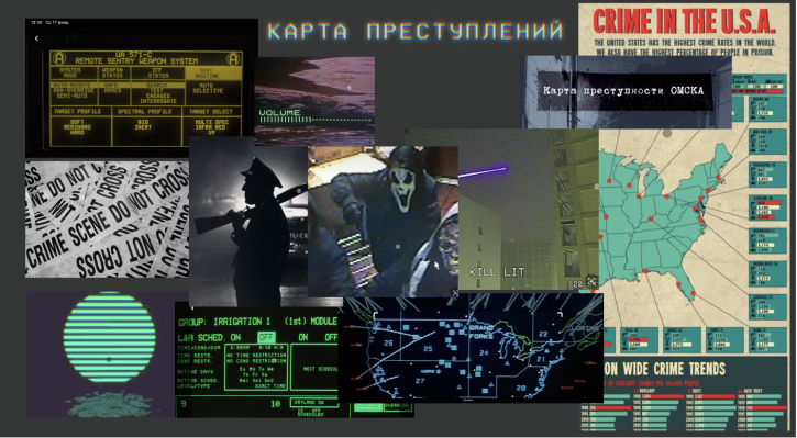
The visual direction needed to support a serious editorial subject while giving the project a distinctive identity of its own. I developed the concept and visual system around the data, combining editorial typography, visualization, motion, and interactive elements into a single experience. Rather than making every chart look like a conventional analytics dashboard, I treated each visualization as part of the storytelling.
Building the experience
Pushing Webflow beyond the obvious
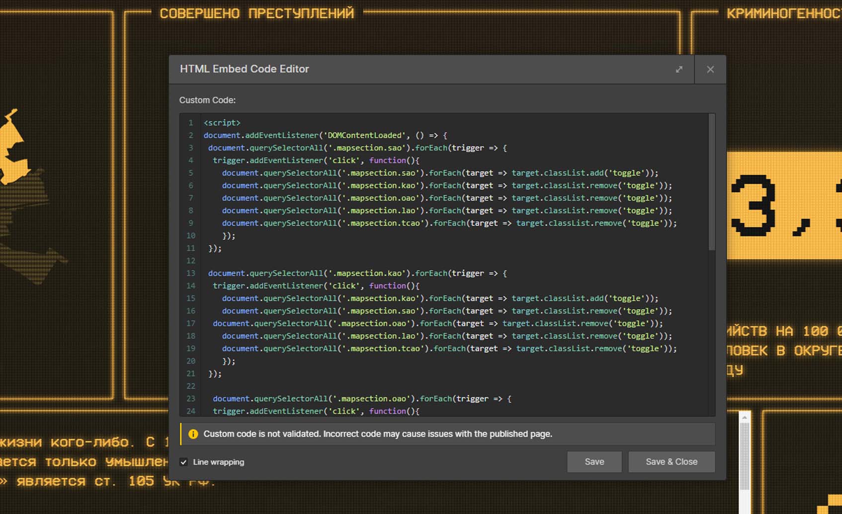
The biggest technical challenge was that many of the interactions and animated visualizations I had designed weren't available as native Webflow functionality. Instead of simplifying the concept around the limitations of the platform, I extended Webflow with JavaScript and Lottie to build animated charts and custom interactions. This allowed me to keep Webflow as the foundation of the project while using code wherever the experience demanded more.
Design first. Platform limitations second.
The result
An experiment that found its audience
Criminal Omsk launched as an experimental editorial format and reached 100,000+ readers, showing that a data-heavy local story could become an engaging digital experience.
More importantly, the project demonstrated a new way for the media company to approach special projects — combining editorial content, data visualization, interaction, and technology into formats that could also be offered to commercial partners.
Recognition
Awwwards Honorable Mention
The project was later recognized with an Awwwards Honorable Mention, giving an experimental local-media project international exposure.
What began as a standard news article became one of the projects that best demonstrated what our digital team was capable of.