

Building a fast-food brand from scratch
JanCroissant is a self-initiated café concept designed with the ambition to grow into a scalable chain. I created everything from the ground up — from the initial concept and brand identity to photography and an investor-facing website.
Brand Strategy Visual Identity Web Design Webflow Photography Art Direction
The idea
What if a croissant became fast food?
JanCroissant started as a simple idea: take a familiar product and rethink it as a modern fast-food format. Instead of positioning croissants as an occasional bakery treat, the concept turns them into the core of a bright, accessible café brand designed to be recognizable, repeatable, and eventually scalable across multiple locations. The project started with no existing brand, visual language, or digital presence — just the idea.
The challenge was to make an imaginary business feel like a real one.
The brand
Defining the visual direction
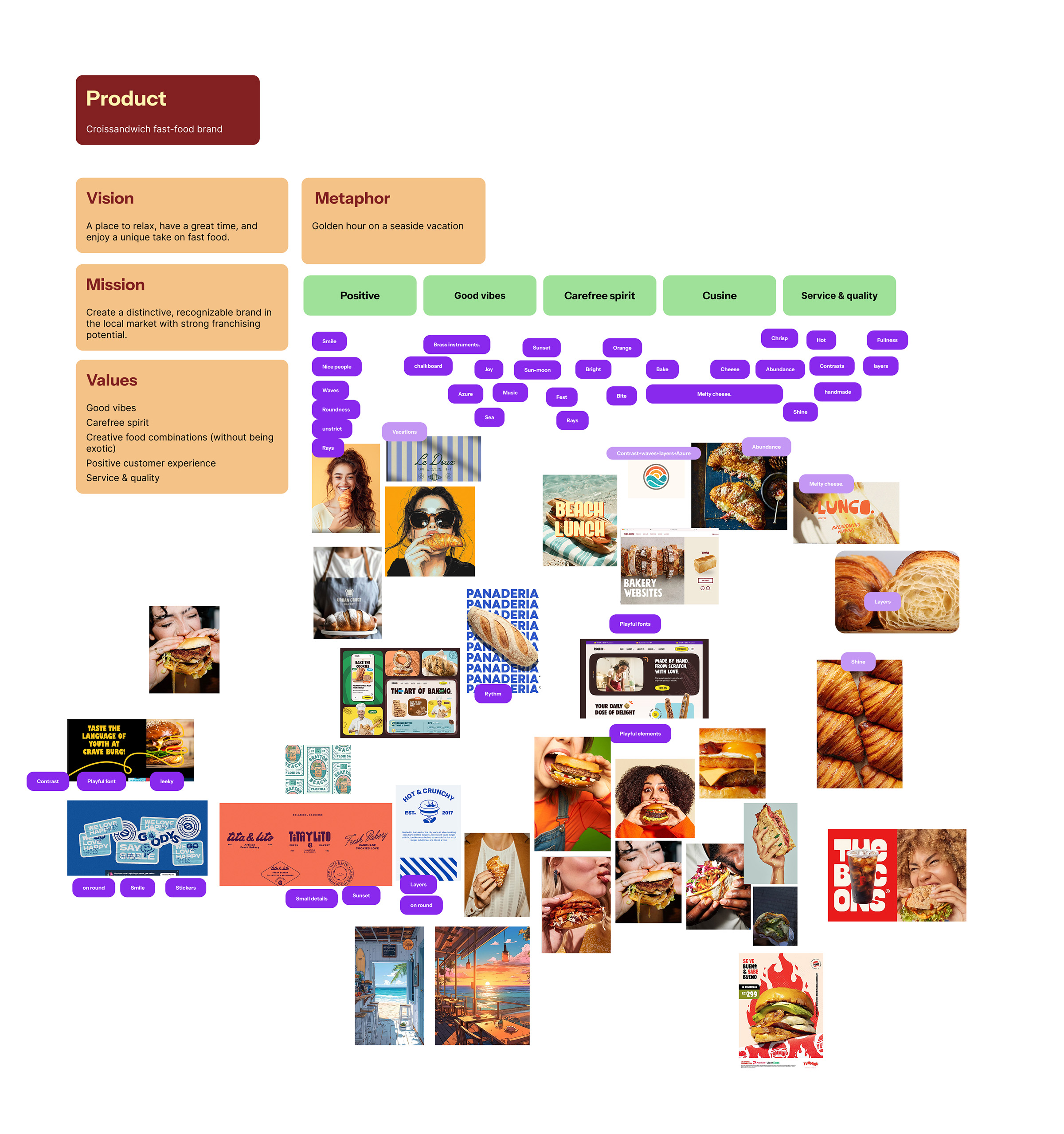
Before designing the identity, I mapped the brand's vision, values and personality into a set of visual associations and references. The central metaphor — a golden hour on a seaside vacation — helped define a bright, playful and carefree direction for the brand.
Designed to get noticed
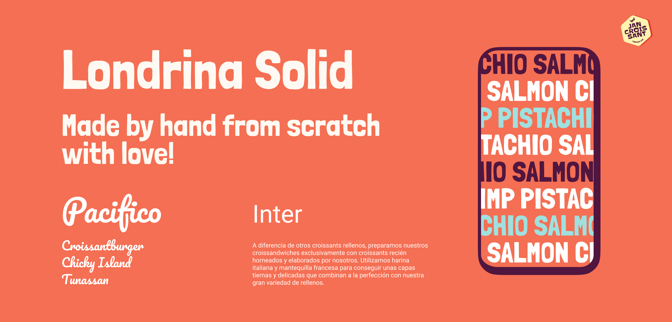
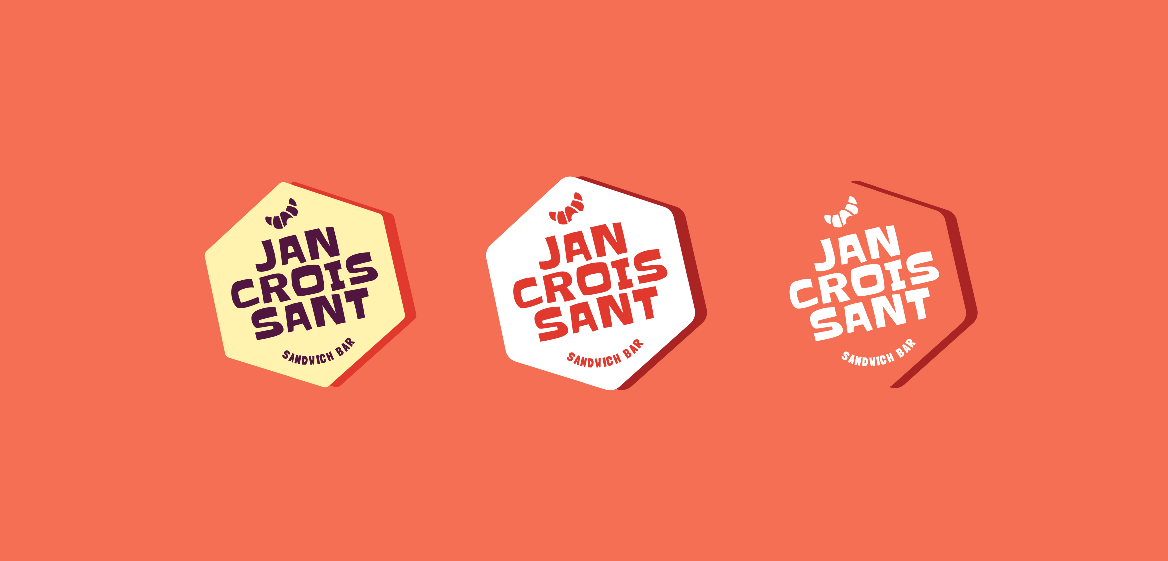
Fast food competes for attention. The identity needed to communicate the product almost instantly while being distinctive enough to build recognition around it. I developed the entire visual language from scratch: logo, typography, color palette, graphic system, photography direction, packaging concepts, and digital applications. The result is intentionally bright, playful, and direct — a brand designed to feel fresh rather than like another traditional bakery.
Photography
Making the concept tangible
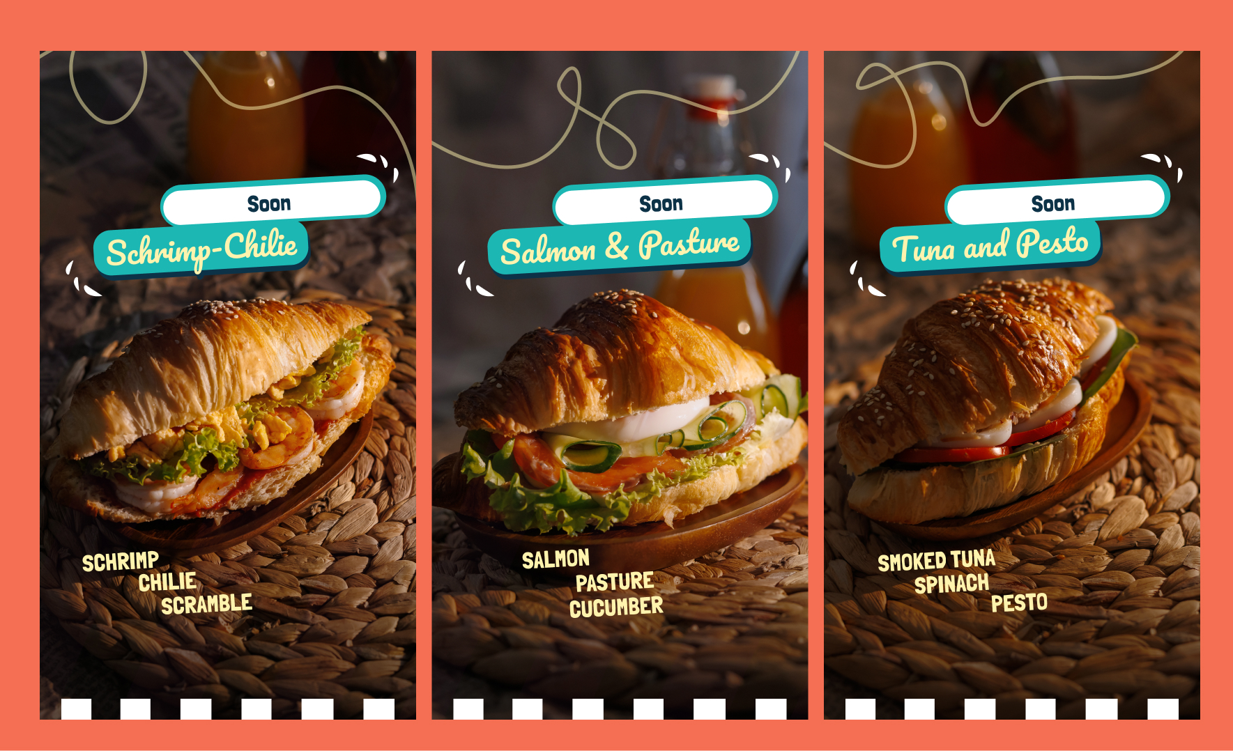
Because there was no existing café or established visual library to work with, photography became an important part of making the concept believable. Instead of relying on stock imagery or AI-generated visuals, I invested in a dedicated photoshoot and art-directed the imagery around the new identity. This gave the brand a real product and visual presence that could be used consistently across the website, presentations, social media, and future marketing materials.
The website
From brand concept to investor pitch
The first website wasn't designed as a typical café website. At this stage, JanCroissant is focused on attracting investment, so the goal was different: turn the concept into something investors could understand, experience, and remember. I designed and built a focused Webflow landing page that brings the business idea, visual identity, product, and growth ambition together into one narrative. Rather than simply presenting a logo and some mockups, the website makes JanCroissant feel like a brand ready to exist in the real world.

Building lean
Spend on the product, not the process
As a self-funded project, JanCroissant had no traditional design or development budget. The main expenses were the things I couldn't create myself: the photoshoot, website hosting, and Webflow subscription. Everything else — concept development, branding, art direction, web design, and development — was handled by me.
It was a useful constraint: build enough of the brand to validate and pitch the idea without spending money pretending to already be a large company.
Current stage
From concept to opportunity
JanCroissant was published on Sdelka.kz, a business marketplace in Kazakhstan, to test interest in the concept beyond the design itself. The project presentation received more than 4,000 views and led to several partnership proposals from people interested in developing the idea further.
The next step is taking the concept into the real world. An MVP is currently being prepared in my new home city, with the first public test planned as part of a local food festival — an opportunity to validate the product, customer response, and business model with a real audience.
The business is still at an early stage — but the idea no longer looks like one.